✨ Welcome to GoldQ

Luxury Gold Jewelry React & Tailwind CSS Template

Premium React & Tailwind CSS template for luxury jewelry. GoldQ showcases refined gold collections, elegant designs, and premium pieces with modern responsive UI for everyday luxury and special moments.

Explore Our Platform

Preview our pages and access documentation

Home & Inner Pages

Demo's

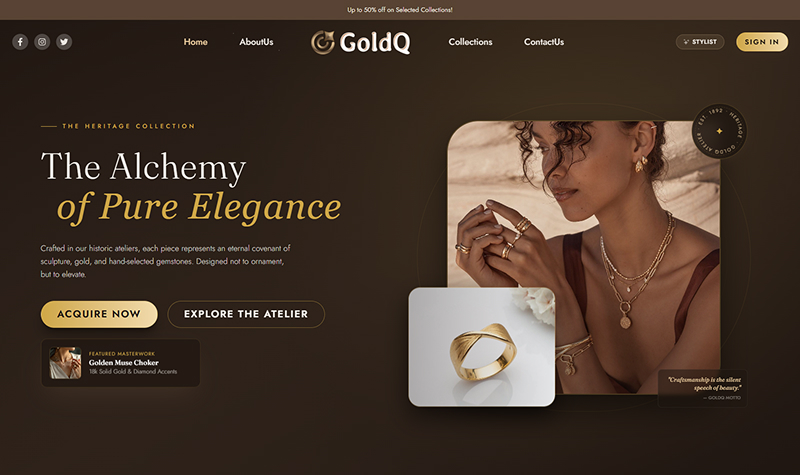
Home

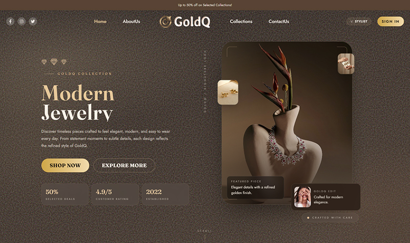
Home 2

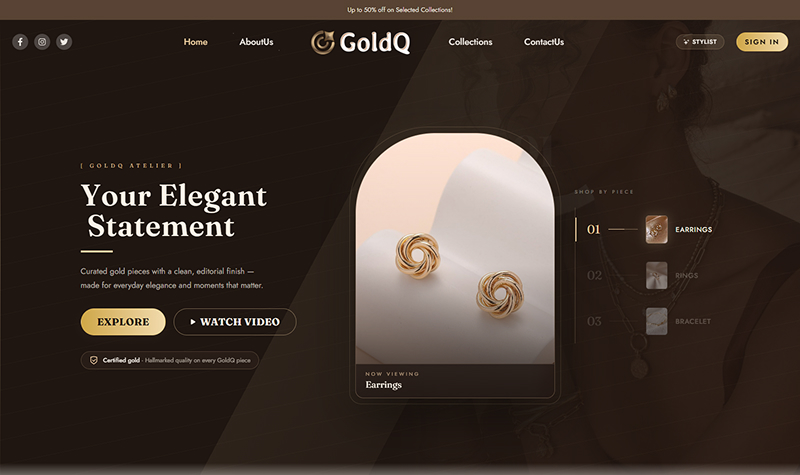
Home 3

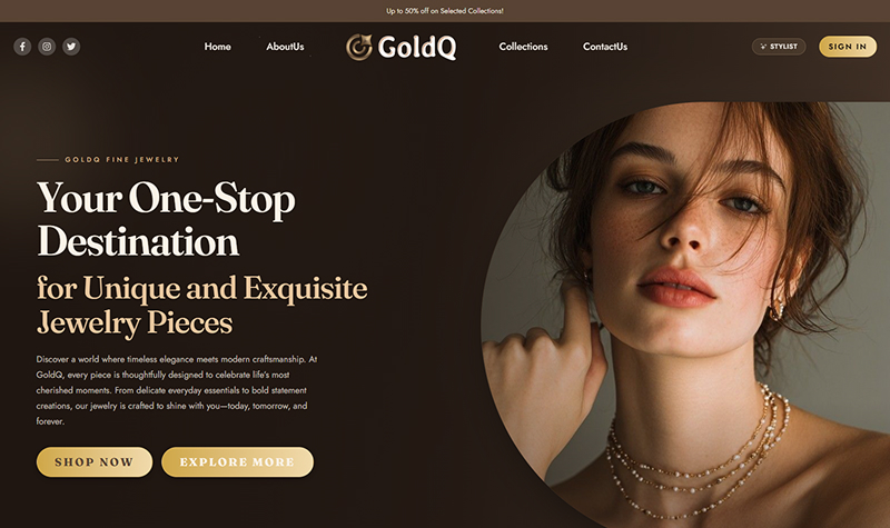
Home 4

About Us

Collections

Contact Us

Auth Pages

Pages

Sign In

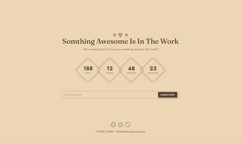
Coming Soon

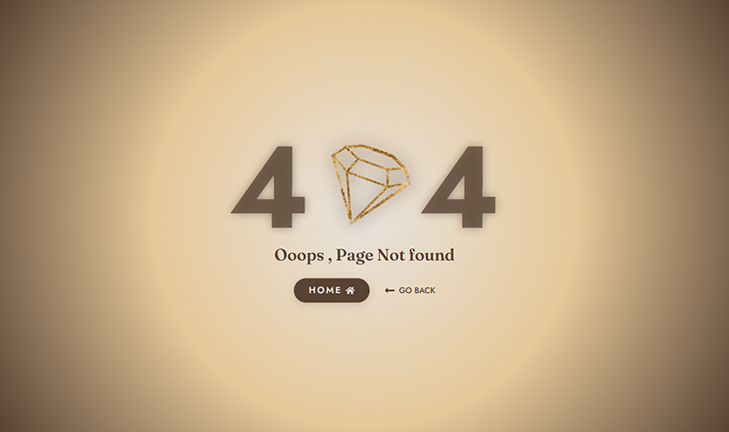
Not Found

1

Introduction

πŸ›’ License Information

Standard License – Use this item in one end product for personal or business projects and client work.

Unlimited Projects Add-on – Allows use of this item in an unlimited number of end products and client projects.

Commercial Add-on – Allows the end products to be sold or offered with subscription or paid access.

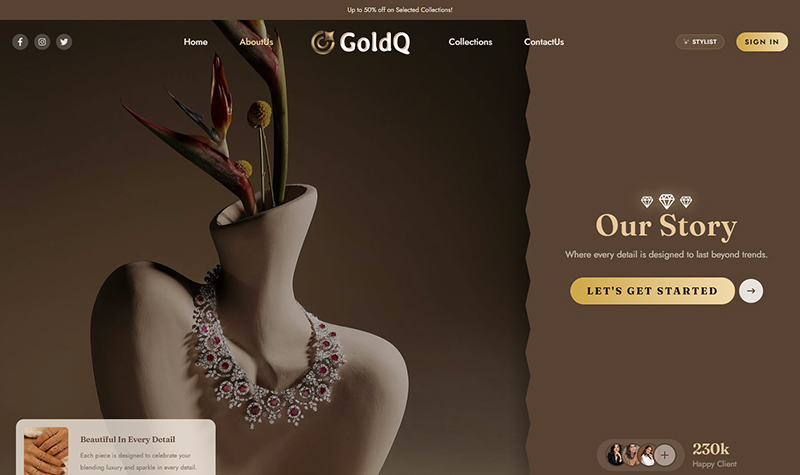
Welcome to GoldQ. This website presents a luxury jewelry collection with elegant home layouts, curated product showcases, collections, contact, and utility pages. It is built with React 19, modern styling, and reusable UI components for a polished shopping experience.

Luxury Home Views

Elegant home layouts that showcase featured jewelry with a premium editorial feel

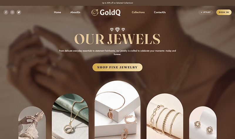
Curated Product Pages

Showcase rings, collections, and featured pieces with refined product presentation

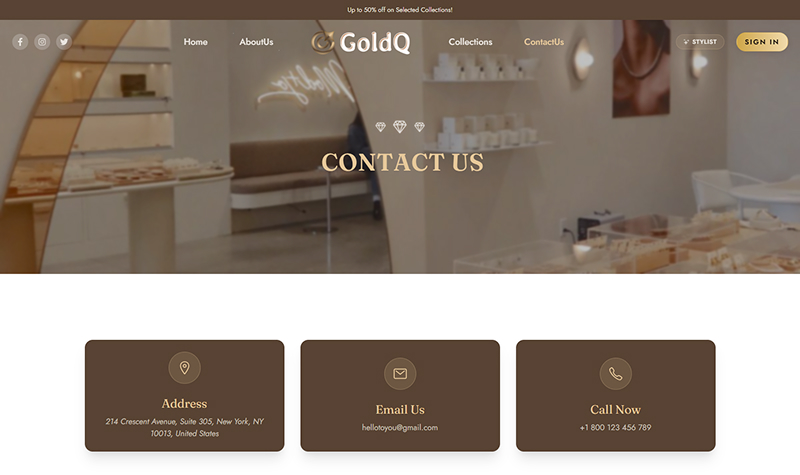
Contact & Support

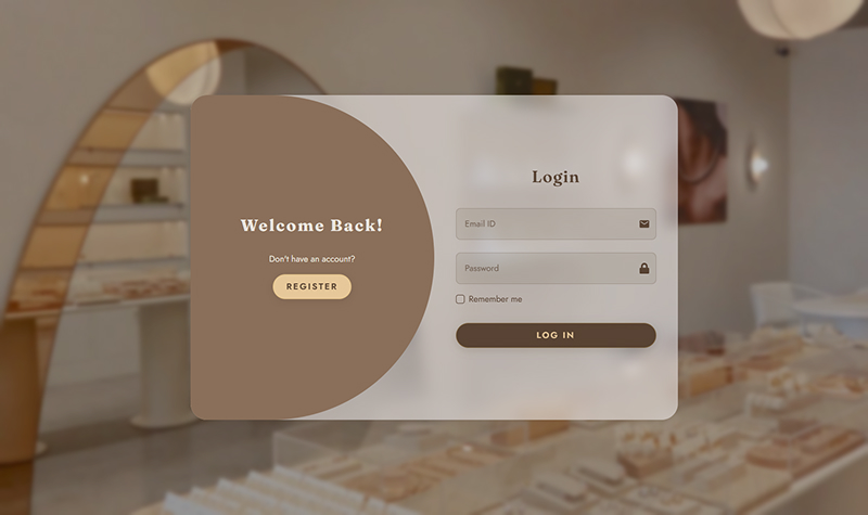
Clear contact and utility pages for customer support, sign-in, and browsing assistance

2

Folder Structure

goldq/
β”œβ”€β”€ public/                  # Static assets
β”‚   β”œβ”€β”€ documentation/       # Documentation site
β”‚   └── images/              # Project images                      
β”œβ”€β”€ src/
β”‚   β”œβ”€β”€ components/          # React components organized by feature
β”‚   β”‚   β”œβ”€β”€ aboutus/         # About page components
β”‚   β”‚   β”œβ”€β”€ collection/      # Collection/product components
β”‚   β”‚   β”œβ”€β”€ contactus/       # Contact page components
β”‚   β”‚   β”œβ”€β”€ home/            # Homepage components
β”‚   β”‚   β”œβ”€β”€ loader/          # Loading components
β”‚   β”‚   └── ui/              # Reusable UI components
β”‚   β”œβ”€β”€ context/             # React Context for state management
β”‚   β”‚   └── LikeContext.jsx  # Favorites/Wishlist context
β”‚   β”œβ”€β”€ hooks/               # Custom React hooks
β”‚   β”‚   └── useScrollAnimation.js
β”‚   β”œβ”€β”€ layout/              # Layout components
β”‚   β”‚   β”œβ”€β”€ Header.jsx
β”‚   β”‚   β”œβ”€β”€ Footer.jsx
β”‚   β”‚   └── Layout.jsx
β”‚   β”œβ”€β”€ pages/               # Page components
β”‚   β”‚   β”œβ”€β”€ Home.jsx
β”‚   β”‚   β”œβ”€β”€ Home2.jsx
β”‚   β”‚   β”œβ”€β”€ Home3.jsx
β”‚   β”‚   β”œβ”€β”€ Home4.jsx
β”‚   β”‚   β”œβ”€β”€ About.jsx
β”‚   β”‚   β”œβ”€β”€ Collection.jsx
β”‚   β”‚   β”œβ”€β”€ Contact.jsx
β”‚   β”‚   β”œβ”€β”€ SignIn.jsx
β”‚   β”‚   β”œβ”€β”€ ComingSoon.jsx
β”‚   β”‚   └── NotFound.jsx
β”‚   β”œβ”€β”€ router/              # Routing configuration
β”‚   β”‚   └── RoutesPath.jsx
β”‚   β”œβ”€β”€ data/                # Mock data
β”‚   β”‚   └── mockdata.json
β”‚   β”œβ”€β”€ lib/                 # Utility functions
β”‚   β”‚   └── utils.js
β”‚   β”œβ”€β”€ App.jsx              # Root component
β”‚   β”œβ”€β”€ main.jsx             # Entry point
β”‚   └── index.css            # Global styles
β”‚
β”œβ”€β”€ Configuration Files:
β”œβ”€β”€ vite.config.js          # Vite configuration
β”œβ”€β”€ tailwind.config.js      # Tailwind CSS configuration
β”œβ”€β”€ jsconfig.json           # JavaScript configuration
β”œβ”€β”€ eslint.config.js        # ESLint configuration
β”œβ”€β”€ components.json         # Component library config
β”œβ”€β”€ package.json            # Dependencies & scripts
β”œβ”€β”€ README.md               # Main documentation
β”œβ”€β”€ package-lock.json       # Dependency lock file
β”‚
β”œβ”€β”€ Other:
β”œβ”€β”€ .gitignore             # Git ignore rules
└── index.html             # Main HTML entry
Key Directories:
src/pages/

10 complete pages: Home, Home2, Home3, Home4, About, Collection, Contact, SignIn, ComingSoon, NotFound

src/components/

50+ reusable components organized by feature (aboutus, collection, contactus, home, loader, ui)

src/layout/

Header, Footer, and Layout components for consistent page structure

src/context/ & hooks/

LikeContext for favorites management and useScrollAnimation hook

public/images/

All product images: avatars, categories, collections, logos, promo, and more

Documentation Files

README.md, INSTALLATION.md, CONFIGURATION.md, COMPONENTS.md, and more

3

Changelog

1.0.0 17 July 2026 - Initial Release
  • Luxury Home Demos - Multiple home variants with premium hero sections and elegant product storytelling
  • Product Collection Pages - Curated jewelry displays for rings, necklaces, bracelets, and featured items
  • Contact & Utility Pages - Contact, sign-in, coming soon, and not found pages for a complete experience
  • Modern UI/UX - Built with React, responsive design, and polished shared components
  • Reusable Layout System - Consistent header, footer, and page structure across the site
4

Installation Guide

Install Dependencies
npm install
Start Development Server
npm run dev
5

Tailwind CSS Setup

GoldQ is built with Tailwind CSS v4, a utility-first CSS framework for rapidly building custom user interfaces. This template uses Tailwind CSS for all styling, providing a flexible and efficient way to customize the design.

Configuration Files

Tailwind CSS is configured through the following files:

  • tailwind.config.js - Main Tailwind configuration file with theme customization, plugins, and content paths.
  • src/index.css - Global styles with Tailwind directives and CSS variables for theming.
  • vite.config.js - Vite configuration includes Tailwind CSS Vite plugin for fast compilation.
Utility-First CSS

Use pre-defined utility classes like flex, gap-4, text-primary to build responsive designs without writing custom CSS.

Theme Customization

Customize colors, fonts, spacing, and more in tailwind.config.js to match your brand identity.

Extending Tailwind Configuration

Example: Adding a custom color to the theme

// In tailwind.config.js
module.exports = {
  theme: {
    extend: {
      colors: {
        'custom-gold': '#E6C89A',
        'luxury-dark': '#1a1a1a',
      },
      spacing: {
        '128': '32rem',
      }
    }
  }
}

After updating the config, restart your development server to see changes.

Common Tailwind Utilities Used
Utility Class Purpose Example
flex, gap-* Layout and spacing flex gap-4 items-center
text-*, font-* Typography text-lg font-bold text-primary
bg-*, border-* Colors and borders bg-primary border-2 border-gray-200
p-*, m-* Padding and margin p-4 m-2 mb-8
rounded-*, shadow-* Styling and effects rounded-lg shadow-md hover:shadow-lg
responsive: Responsive design md:flex-row lg:p-8
Pro Tips
  • Use @apply: Extract repeating utility combinations into custom CSS classes using @apply directive.
  • Dark Mode: Tailwind supports dark mode with dark: prefix for responsive dark themes.
  • PurgeCSS: Tailwind automatically removes unused styles in production for smaller bundle sizes.
6

Package Dependencies

Here are the key dependencies and their versions used in the GoldQ project:

Package Version Description
@fontsource-variable/geist ^5.2.8 Variable font package
@gsap/react ^2.1.2 GSAP integration for React
@react-three/fiber ^9.6.1 React renderer for Three.js
@tailwindcss/vite ^4.2.2 Tailwind Vite integration
class-variance-authority ^0.7.1 Class variants helper
clsx ^2.1.1 Conditional className utility
framer-motion ^12.38.0 Animation library for React
gsap ^3.15.0 Professional animation library
lucide-react ^1.12.0 Icon library
react ^19.2.4 Core React library
react-dom ^19.2.4 React DOM rendering
react-icons ^5.6.0 Icon set for React
react-router-dom ^7.13.2 Routing for React applications
radix-ui ^1.4.3 Accessible UI primitives
swiper ^12.1.3 Touch slider and carousel library
tailwind-merge ^3.5.0 Merge Tailwind class names safely
tailwindcss ^4.2.2 Utility-first CSS framework
three ^0.167.1 3D graphics library
tw-animate-css ^1.4.0 Tailwind animation utilities
7

File Customization

Core Pages
  • pages/Home.jsx - Main home page
  • pages/Home2.jsx - Alternate home layout
  • pages/Home3.jsx - Third home layout
  • pages/Home4.jsx - Fourth home layout
  • pages/Collection.jsx - Jewelry collection page
Layout & Components
  • layout/header.tsx - Top navigation bar
  • layout/Footer.jsx - Footer component
  • layout/footer.tsx - Footer component
  • components/ui/ - Shared UI components
Configuration Files
  • src/index.css - Global styles & theme
  • vite.config.js - Vite configuration
  • src/router/RoutesPath.jsx - Route definitions
  • src/lib/utils.js - Utility functions
8

Color & Font Customization

Color Customization

Customize your theme colors by editing CSS variables in src/index.css

Theme Colors (OKLCH Format)
// In src/index.css
:root {
  --primary: oklch(49.706% 0.24691 293.51);
  --sidebar-primary: oklch(60.779% 0.2717 319.782);
  --background: oklch(13.558% 0.02475 282.596);
  --foreground: oklch(0.984 0.003 247.858);
  --card: oklch(100% 0.00011 271.152 / 0.06);
  --border: oklch(100% 0.00011 271.152 / 0.12);
  --accent: oklch(0.279 0.041 260.031);
  --muted: oklch(0.279 0.041 260.031);
  --destructive: oklch(0.704 0.191 22.216);
}
Font Customization

GoldQ uses your project’s styling system and reusable typography. Customize fonts and spacing from the shared CSS files.

Custom Font Setup
// In src/index.css
@font-face {
body {
  font-family: var(--font-jost);
}

h1, h2, h3, h4, h5, h6 {
  font-family: var(--font-playfair-display);
}
9

Credits

Core Technologies
Styling & UI
Images & Photography
  • Unsplash - Premium royalty-free photography
  • Pexels - High-quality stock images
  • Freepik - Vector assets and jewelry photography
Typography
10

Support

Need Help?

We offer 6 months of support for any questions or issues you may encounter.

Features

Our Core Features

Discover the powerful technologies and tools that make our platform exceptional

React
React Js

Dynamic UI Library

Bootstrap
Tailwind CSS

Utility-First CSS Framework

Bootstrap
Framer Motion

Smooth UI animations

HTML 5
HTML 5

Web Structure

CSS 3
CSS 3

Modern Styling

Responsive
Responsive

Mobile Friendly

Google Fonts
Google Fonts

Web Typography

Icons
Icons

Vector Graphics

Modern Design
Modern Design

Clean Aesthetics

Easy Customizable
Easy Customizable

Flexible Components

Clean Code
Clean Code

Optimized Structure

Well Documented
Well Documented

Clear Guides

24/7 Support
24/7 Support

Always Available

Get Started with GoldQ - Luxury Jewelry Website

Purchase Now!